
By Dishan Jay
Good web design is a bit like clean air. You never really think of it, until the garbage truck passes you by and you realize how indispensable it is. It’s often dismissed until lack of it becomes a hazard. The same thing happens with nonprofits and design. It gets overlooked, downright ignored in favor of something basic just to “get things out there,” because often“there simply isn’t a budget for fancy stuff.”
But that’s the biggest – and to be fair – the easiest mistake to make, thinking that an effective design is also fancy. Good design has a purpose without it being obvious. Great design drives people’s attention to the right details, steers the visitor’s eyes to the donate button, or gives the visitor a subconscious impulse help out.
The truth is, as human beings, we want to identify with something, or we want to be distracted by the things we access online, and if that doesn’t happen within the first few seconds, we’re going to go somewhere else to get that.
And we do. Social media, AI, augmented reality, and virtual reality are all becoming parts of a larger new design trend with some more common, yet very effective and useful concepts and design patterns, a few of which you could call proven recipes for success in getting more user engagement and thus more donations.
There are a number of straight-forward concepts you can use on your nonprofit’s site, so you’ll increase donation chances every time a website visitor lands on it.
Tell your story right from the start: on your Homepage
While there are other nonprofits with a similar mission as yours, your story can differentiate you from the crowd. You are the only one who can share your story, so why not draw web visitors’ attention to the “story” part of your website?
Alex’s Lemonade Stand’s homepage does not go unnoticed. They convey the right message while using lively colors to grab a visitor’s attention.
They also support their story with images and testimonials, which demonstrate their hard work, so that visitors won’t feel they are being taught about how great their cause is. After all, stories appeal much more to the emotional side of human nature.

Additionally, a nonprofit might feature bright colors to grab a visitor’s attention, just like The GETTS Foundation does, portraying their story in an easy to follow way.

Takeaways: Choose beautiful color palettes that grab attention and convey your story using facts combined with an emotional connection.
Your donation form – keep it simple
Due to their hidden donation forms, usually tucked under menus or other pages, many nonprofits reduce the number of donations they could receive, making it a difficult and time-consuming activity for users who are generally on the hunt for specific information.
Furthermore, they complicate their donation forms by adding too many fields, and donors really hate completing long forms.
So, grab their attention right from the start and make sure to limit your donation form to only a few important fields. Charity water’s donation form is a perfect “How to”example.
With a minimalist design, its strong imagery and message supports their reason for giving.

Furthermore, it is limited to a small number of fields, which appeals to donors who want to donate right away rather than being forced to complete multiple required fields, which would only increase the chances of someone abandoning the process and never end up donating.
So, don’t distract donors by overfilling your form with useless information and keep both your donation form and page simple and straightforward.
Also, don’t forget to make it even simpler for mobile devices. Reduce the donor’s need to zoom by optimizing it with easy-to-click buttons and a vertical layout.
Another great way to improve your donation form is to use giving levels. Take Livestrong’s donation form for example. Your goal is to get people to give larger amounts of money than they’d donate if they wouldn’t receive suggested giving amounts.
If you start your giving levels from $20, $30 and so forth, the donor might round up and give $20 instead of $15. You can also include a box for “other” if people decide to donate a different amount.

Takeaways: Simplify. Make the action of donating easy: for the best user experience possible, stick to one image situated at the top of the form or in the background, add a few sentences of reasons to donate, and keep your donation form concise.
Add social proof and gain more donors
By placing a social proof, you can persuade a prospective donor to join others who have already supported your cause. Alex’s Lemonade Stand is definitely attracting new donors with this tactic. It’s simple, people care about what others recommend.
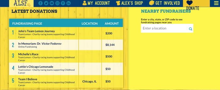
Takeaways: You can increase the visibility of your nonprofit and its credibility by tapping into social proof to also gain new donors.
Stop neglecting your website’s footer
Your ultimate goal is not only to gain trust, but also continuing support from your visitors, so you have to pay attention to your website’s footer as well.
The footer is your last opportunity to get users to where you need them to go, while also giving them important information. The Case Foundation connects with their visitors by letting them receive ongoing information on several topics if they subscribe.
Takeaways: Stick to relatively minimal information in your footer to convert into subscriptions.
What actions would you like your visitors to take? Be it donating, signing up for your newsletter, or Social Media appreciations, your nonprofit website should be designed around these specific actions. So, be sure you make those “calls to action” obvious. Also, don’t forget to tell your story simply and clearly. Hopefully, these tips will help you maximize the value you can get from each person who visits your website.
Dishan Jay is the founder of DG Studio, a Los Angeles based digital agency that develops websites and apps, and executes marketing strategies plus storytelling and design techniques around them. 

[…] adjusting your website design and donation opportunities to appeal to mobile donors, you open up a new avenue for giving to your […]
LikeLike