Imagine you’re searching for a cause you’re passionate about and find a nonprofit that aligns with your values. You click through to their website, excited to find out how you can get involved.
However, when you get there, you notice that there’s no easy way to find the donation or volunteer pages. After scrolling through the whole site, you give up and search for another similar organization to support.
This nonprofit website needs a major revamp. Your website is one of your most helpful marketing tools, and if it’s functioning correctly, it should convert interested users into supporters of your cause.
You can facilitate this process by implementing effective calls to action (CTA) on your website. The top nonprofit websites have clear, precise, and engaging CTAs that help users interact with their content. In this article, we’ll explore five tips to upgrade your CTA strategy and gain more support for your cause. Let’s get started!
1. Make it clear where calls to action will take users.
Your calls to action should be specific and relevant to the link you’re driving traffic to. Otherwise, you may create a misleading CTA that discourages users from interacting with your site.
For example, Kanopi’s guide to healthcare website design features the Cleveland Clinic’s website CTAs because of how useful they are to users. The website’s homepage has CTAs such as:
- “Find a doctor.” This CTA allows users to search for doctors within their system using different qualifications like name, specialty, and location.
- “Get directions.” This CTA helps users find the closest clinic location and pull up Google Maps directions to get there.
- “Schedule now.” This CTA directs users to easily schedule an online or in-person appointment.
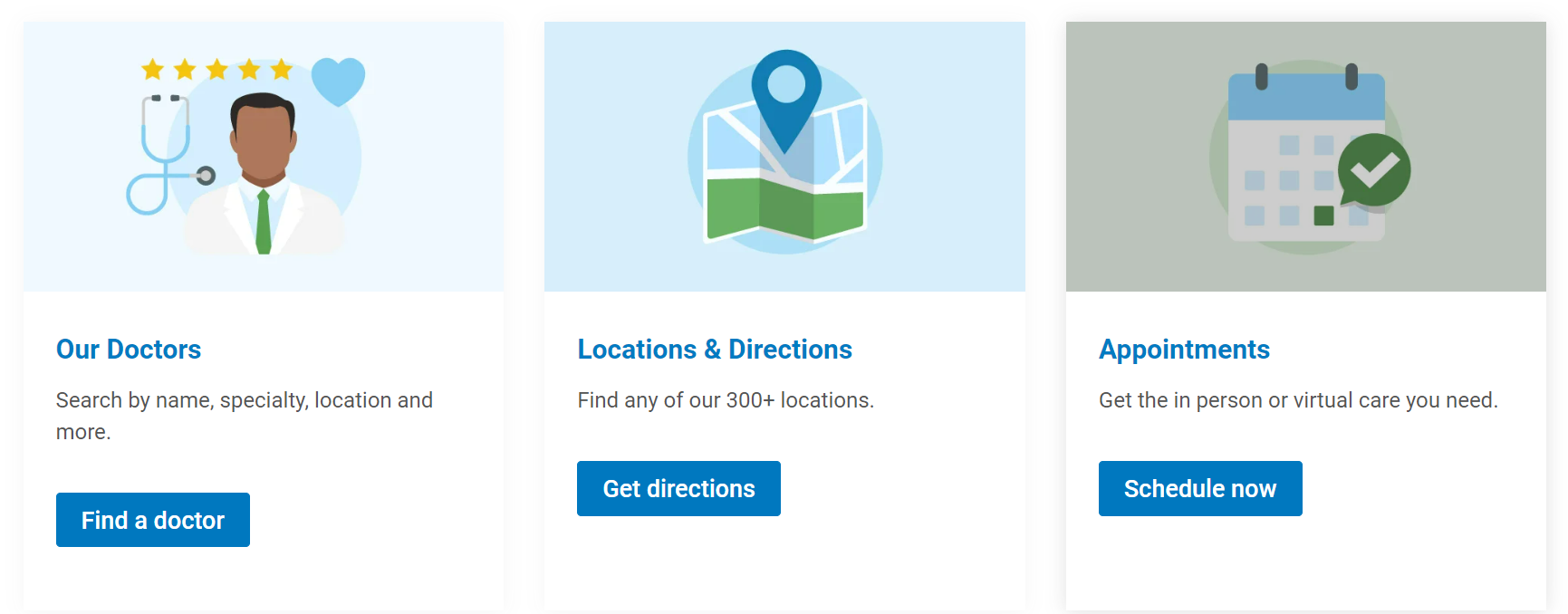
These calls to action are more effective than generic asks such as “Click here” because they help people understand exactly what they’re clicking through to, thereby increasing conversion rates.
As another example, let’s say you’re hosting an event. Don’t just create a CTA that says “Learn more” and links to your event page. Be as specific as possible with CTAs like “Purchase a ticket,” “Sign up here,” or “Register for this event today.”
2. Change your calls to action to reflect your current priorities.
Even if you have strong CTAs on your website already, they could likely be updated to reflect your current priorities. When you determine your nonprofit’s goals for the quarter, make a note to change your website to reflect those initiatives. That way, you can direct users to the most relevant pages on your website at the current moment.
For example, you may search through your supporter CRM and notice that your animal shelter’s volunteer registrations have been lower than usual over the past few months. As a result, you decide to prioritize promoting volunteer registration opportunities. To effectively recruit new volunteers, create calls to action on your website that link to your volunteer registration page and encourage people to sign up.
3. Experiment with different calls to action.
If you stick to the same CTAs, you’ll never know if you could produce ones with better conversion results. There are so many different ways you could switch up your calls to action.
To begin, consider making different graphic design choices with your CTAs. For example, if your brand’s colors are blue and green, you may make half of your calls to action blue and the other half green to add some variety.
You can also change the location of your calls to action. Try adding CTAs to the top, middle, and bottom of pages for maximum engagement. You may even have the most important CTAs in your header or footer to encourage users to take action no matter what page they’re currently on.
Play around with different CTA formats in your content management system (CMS). For example, WordPress allows you to create button CTAs. You can customize these buttons by changing the font, incorporating your brand colors, and adding a drop shadow.
To test which CTA choices your audience best responds to, consider conducting A/B testing. Make sure you’re only altering one aspect of your CTAs at a time so you can determine which elements matter most to users.
4. Include educational calls to action.
According to Bloomerang’s donation page guide, the submit button on your donation form is the most important CTA on that page and perhaps the most important on your entire site. While this is certainly true, it’s also good practice to create calls to action that point to helpful educational resources like blog articles or online courses.
When you direct users to educational resources in addition to conversion-based pages, you allow them to learn more about your organization and glean more value from your website. This extra information might even push people to convert who weren’t intending to before.
For example, someone interested in supporting forest rehabilitation may bounce from a sustainability-based organization’s page if it’s not clear what the nonprofit’s priorities are. However, if that nonprofit includes a CTA that links to a blog article about all the individual causes their organization supports, then that user could find the section about forest rehabilitation and decide to donate as a result.
Educational calls to action also help people stay on your website longer, which can boost SEO rankings. When search engines see that people are interacting with your website for a significant amount of time, they conclude that your website provides valuable information for users and will rank it higher on the search engine results page.
5. Tell a story with your call to action.
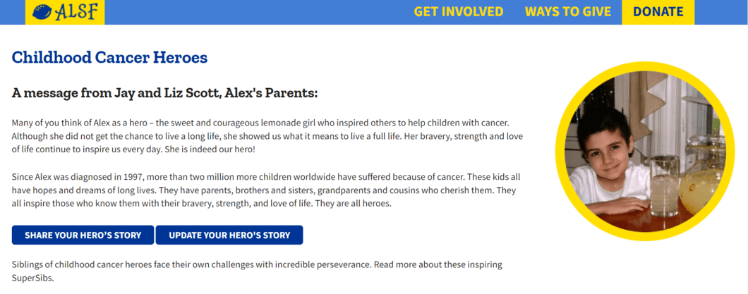
Storytelling helps people connect with your nonprofit and motivates them to give. Your donation requests will feel more natural when you first include a story about one of your beneficiaries and how your organization has helped them. For example, Alex’s Lemonade Stand has a page that features real children their organization has supported. Then, you can add a call to action that encourages people to contribute to help others like the beneficiary in your story.
You can also enhance your CTAs by accompanying them with a short video of your beneficiaries or staff. Videos are compelling because they can tell a story in a more interesting, engaging way.
Reach out to your beneficiaries to see if any of them would be interested in telling their story in video form. For example, an animal shelter may interview a family who recently adopted a dog. After you’ve finished filming and editing the video, add it to your donation page, volunteer registration form, or any other relevant page where you’re trying to increase conversions.
With the right calls to action, you make it clear how current and potential supporters can help your organization reach its goals. As a result, you’ll have a more effective website that helps earn even more for your cause.