ARTICLE
How To Fix Dismal Nonprofit Board Engagement With Financial Reports


7% nonprofit board engagement is not enough! Do your nonprofit’s financial reports speak to the full board? Can everyone in management engage with them and understand key information?
If your financial reports don’t go beyond numbers on a page, then they exclude almost all your leaders.
Fortunately, you can start turning that around with some good dashboards.
This is about inclusion, nonprofit board engagement, and legal duty.
When a nonprofit’s whole financial report is just numbers straight from their accounting software, you can be sure some eyes will glaze over. But I only learned recently that it goes beyond just some: 93% of Americans experience math anxiety. 93 percent!
Old, plain financial reports effectively exclude most of your leadership.
That spells trouble. They presumably got invited to the table because of their wisdom and experience, but they can’t engage in this key component of decision-making.
With board members, this creates a legal problem as well. How can they fulfill their fiduciary duty if they can’t engage with the financial reports you presented them?
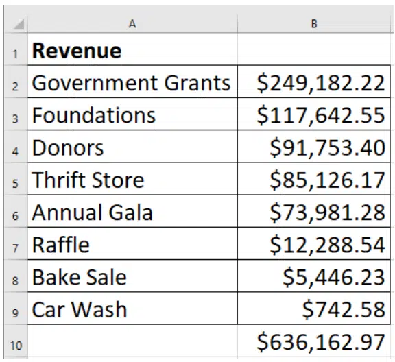
Can you look at numbers like these, quickly understand them, and extrapolate the stories they tell? If so, congratulations, you’re a part of a small, elite group!
For everyone else who can’t: you form part of a very large majority.
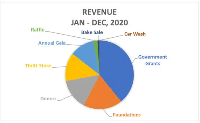
Now look at the same data in a pie chart.
Might this help more of your leaders participate more effectively?
Could it help focus time on the biggest sources of revenue (grants) and away from the smallest (car wash)?
What does it suggest about the consequences of the annual gala getting rained out?
What other helpful questions might it inspire and how might it help you avoid less useful conversations?
When people can’t fully participate in key conversations, it harms everyone:
Exclusion like this tends to fall disproportionately on people from historically marginalized communities, ironically exacerbating a harm that so many nonprofits have committed to addressing.
When you supplement the numbers in your financial reports with 6-8 standard graphs, you will find it transformative.
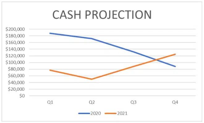
How might this cash projection inform some decisions during the first half of the year? Or help justify opening a new position at the end of the year?
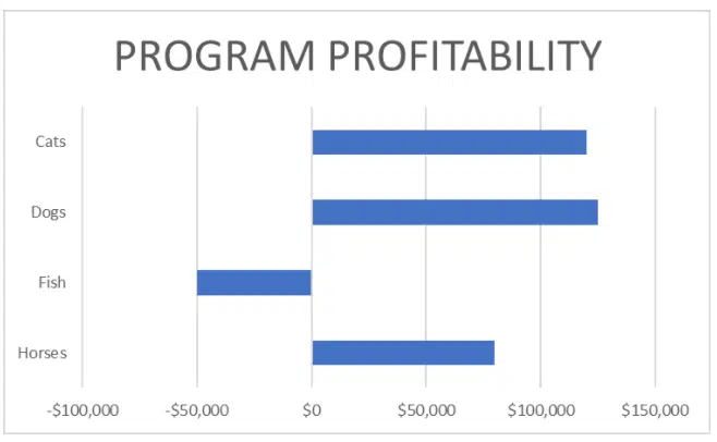
How might this program profitability graph help an organization determine whether to use across-the-board cuts to balance the budget?
Might a graph like this help build true consensus around a difficult decision?
Without a graph like this, how many stakeholders might feel like they got left out of the decision-making processes?
Today’s technology makes it fairly easy to build a good financial dashboard. So while many nonprofits would have seen it as a luxury 20 years ago, more and more now see it as a “must have” to engage their board and management.
Building a basic financial (or other) dashboard doesn’t have to break the bank. And once built, updates can take as little as 30 minutes per month.
So … how will you make sure the other 93% at your nonprofit get engaged?
Download our Do’s and Don’ts of Getting Boards to Fundraise eBook to review why your board isn’t fundraising, and how to fix it this other form of nonprofit board engagement.


Comments
Sean Hale
Angie Albright
Chad Wolver
Chad Wolver
Sean Hale
Nancy Abbott